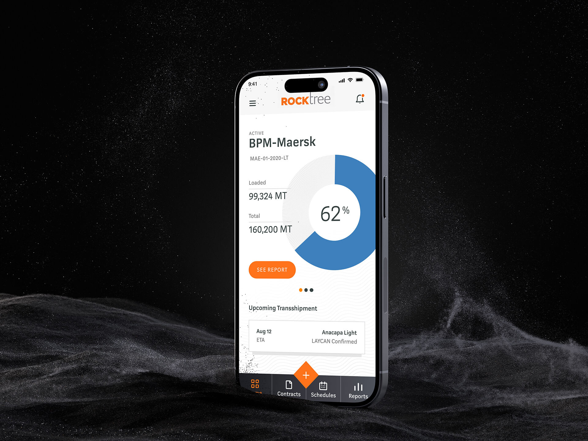
Logistics management app
Empowering customers through intuitive design: A case study on Rocktree
Project details
My role
I led the development of design solutions, ensuring they aligned with project requirements and complemented the overall goals of Rocktree.
Team
Product manager, Business stakeholders,
2 Engineers, user researcher, UX/UI designer (myself)
Research process
Interviews, Usability Testing
Area
Research, UX Design, UI Design
Platform
Mobile app
Duration
Completed in 2 weeks
Tools
XD
Overview
Rocktree, a leading dry-bulk transshipment company, specialises in customised, end-to-end logistics management of marine dry bulk cargo. Rocktree partnered with us to overhaul its customer mobile app and address key shortcomings.
Objectives
Empower users with tools and information to manage their transshipment independently.
Create modern and professional interfaces that enhances user experience and trust.
Approach
Through contextual interview and usability testing, we identified the reasons behind low user engagement and satisfaction. I then translated these insights into design solutions, focusing on streamlined task flows for key actions like shipment tracking, intuitive information architecture, and a visually engaging interface that aligns with Rocktree's brand identity.
The challenges
We started off with stakeholder interview to understand the shortcomings and the needs to improve the over all user experience.
They revealed following key insights:
Rocktree, with its ambition to lead the industry in innovative logistics technology, recognised the need to enhance customer satisfaction and engagement. To achieve this, they sought to streamline their logistics solutions, starting with a complete overhaul of their customer mobile app.
The app's interface was outdated and did not reflect Rocktree's commitment to innovation. This contributed to usability issues and a negative perception of the brand.
Initial assessment
I conducted cognitive walkthrough and heuristics evaluation to identify the task specific and usability issues. By doing this before the usability testing, we were able to fix the surface-level problems and avoid wasting time during the usability test.
The assessment revealed following key findings:
Home page
Home page before redesign
Finding: Home page has a high density of informations, lacking visual hierarchy and clear demarcation between the key elements. This results in a cluttered and overwhelming experience for users.
Recommendation: Prioritise key information for the users by displaying it prominently on the homepage and establishing clear demarcations between different content blocks.
Rationale: A user-friendly homepage encourages exploration and interaction, leading to higher engagement and satisfaction.
Transshipment Page
Transshipment page before redesign
Finding: The presentation of hold loading information lacked visual clarity, making it difficult for users to quickly scan and understand the data.
Recommendation: Implementing visual representations like charts, graphs, or diagrams to display the information in a more intuitive and scannable format.
Rationale: Users can scan and interpret the data more efficiently, saving time and reducing cognitive load.
Schedule Page
Schedule page before redesign
Finding: The design did not effectively communicate the difference between scheduled and unscheduled transshipments, leading to confusion and potential errors.
Recommendation: Use distinct visual styles to represent scheduled and unscheduled transshipments.
Rationale: By providing clear visual distinctions and explicitly labelling the data, will minimise the risk of users misinterpreting information or taking incorrect actions related to shipment types.
To validate these recommendations and and ensure an user-centred outcome, we conducted usability testing of the newly redesigned interface with users, focusing on key tasks and interactions within the app.
Research
Usability testing
We were able to conduct the test with 4 users (3 import managers and 1 company executive), each lasting ~45 minutes, to explore how users interact with revised designs.
Setup:
Participants: Recruited users matching the target personas.
Tasks: Designed tasks reflecting real-world scenarios, focusing on finding shipment information, tracking progress, and accessing contract details.
Methodology: Utilised a combination of moderated and unmoderated testing, allowing for both direct observation and independent user exploration.
Design solutions and recommendations
First iteration - Home page
Better visual representations and clear organisation made easier for users to understand the hold loading information quickly and accurately. However, the interface lacked critical functionality for adding new contracts and tracking multiple ongoing shipments, and availability of CCTV feeds.
Version 1: Home page redesign
Recommendation
Replacing unreliable feed with dynamic circular progress bars offers a clearer way to show loading status. This design change turns inconsistent visual monitoring into a at-a-glance tracking experience, allowing users to quickly grasp shipment progress without feeling overwhelmed.
Version 2: Home page redesign
Outcome
Users demonstrated a remarkable shift in interaction with the shipment tracking interface. Where the previous live feed caused visible frustration, the new circular progress bar design prompted a notable change in behaviour.
First iteration - Transshipment page
The initial test revealed significant usability issues. Technical constraints and complex visual design hindered user understanding.
Version 1: Transshipment page
Second iteration - Transshipment page
To address the above issues, I designed Version 2 of the same pages and tested them with users.
Version 2: Transshipment page
Third iteration - Transshipment page
Participants expressed a need for a more consolidated view of holds. In response to this feedback, I redesigned the page by providing a consolidated progress view and a detailed view.
Version 3: Transshipment page
Outcome
By breaking down the progress into smaller, more manageable views, we reduced the time to discover the loading information by 30%.
First iteration - Schedule page
The redesigned Schedule page prioritises clarity and ease of use, allowing users to efficiently access relevant transshipment information.
Version 1: Schedule page
Outcome
The design employs visual cues to differentiate between shipment statuses and dates. This enhanced readability and allowed users to quickly consume the information information.
Takeaway
Resourceful Design: Even with limited time and budget, impactful UX/UI improvements can be achieved through a focused, iterative process.
User-Centricity: Prioritising user needs and gathering feedback throughout the design process leads to more successful outcomes.
Adaptability: Being able to quickly pivot and respond to user feedback is crucial for delivering a product that truly meets user expectations.


