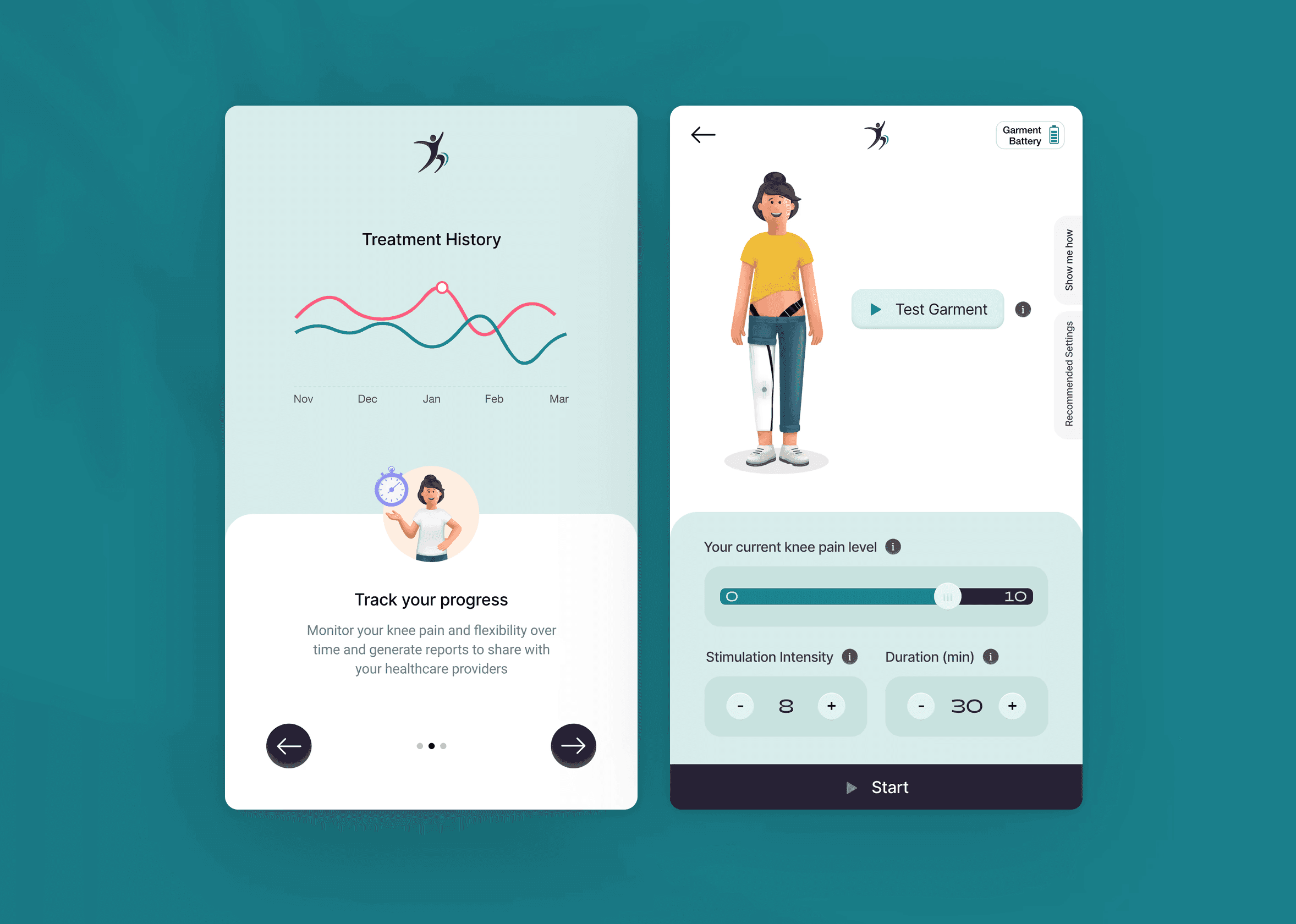
Knee-pain management app
From hypothesis to launch —
A Rejoovinii case study
Project details
My role
I collaborated closely with the science and engineering team to lead design development and prototyping. I also contributed to user research through interviews and usability testing.
Team
Principal researcher, 2 Engineers, Project manager, Medical engineer, and a UX designer (myself)
Research process
Interviews and Usability testing
Area
Research, UX & UI Design
Platform
Mobile App
Duration
Completed in 8 months
Tools
XD, Invision
Overview
People with knee pain in the UK are predicted to increase from 4.7 to 8.3 million by 2035.
To tackle this problem, we developed an electrotherapy wearable garment, run by a digital application, that translates electrode functionalities and stimulation programmes into an intuitive interface.

This project is funded by UKRI Medical Research council. See details
Objectives
Identify and prioritise assumptions about the needs, challenges and behaviours of users with knee pain.
Collaboratively build a minimum viable product (MVP) that addresses the core needs of users with knee pain.
Conduct targeted experiments to test the usability and effectiveness of the features in managing knee pain.
Continuously gather feedback, and iterate on the app's design to optimise its effectiveness in managing knee pain.
Approach
To validate assumptions and ensure the app met user needs for knee pain management, I employed the Lean UX process. This facilitated rapid validation, iterative refinement, and a user-centred design approach.
Outcomes
18%
Increase in customer retention
33%
Increase in new user activation
The challenges
Existing pain management solutions might be inconvenient or ineffective for older adults. Moreover, existing solutions often lack user-friendly interfaces tailored to the needs of older users. These limitations underscore the necessity for an intuitive and accessible design to enhance user experience and treatment outcomes.
Creating assumptions:
Understanding the target users and their interaction with the application is paramount. I collaborated with science and engineering teams to identify and prioritise assumptions about users needs, challeneges and behaviours. This helped me to create a comprehensive understanding of the target users and inform the initial designs.
Key assumptions shaping the designs
Risk level: High
Users need the ability to record pain scores before and after the treatment to evaluate the effectiveness of the therapy.
Rationale: It directly impacts the core functionality of the product for managing pain.
Risk level: High
Users need features like milestones, programme schedules, health reports and training data to track their health and take informed decision
Rationale: It is critical for user engagement.
Risk level: Medium
Users should be able to customise the stimulation programme based on their pain level
Rationale: Optimum level of customisation to be determined as users may prefer pre-set programmes.
Risk level: Low
Users expect real-time feedback on the effectiveness of the stimulations
Rationale: Users would like to understand how the treatment impacts them while using.
Risk level: Low
Users prefer personal and human-like app experience in a medical app
Rationale: It can encourage the users to use it confidently.
Risk level: Low
Users needs rewards to give them a sense of achievement and motivation to pursue their programme goals
Rationale: To promote user engagement.
User interviews
Though the above assumptions provide a good starting point, it’s essential to learn from the users about their needs, challenges and behaviours. So we reached out to a few participants with knee pain.
Participant 01. “I suppose sometimes the pain sort of changes because it can be an ache all the way up the back of my neck…recording pain score will be brilliant”
Participant 04. “You know, some kind of a rating system, obviously. Because often I find lying at night, that's when I get an awful lot of, so the aching, if you know what I mean. So it would be about seeing what patterns arose, you know, and I suppose whether it could get out of it for you.”
Participant 05. “Mmm… I’d go for personalised programme but ya I’m open to the customisation…”
Participant 07. “I've used is my Fitbit app, and things like "Kooth" and "Mind" and "YoungMinds" stuff and the, uh, oh gosh, those would be the main ones… I think they're all absolutely amazing and easy to operate, aren't they?”
Participant 08. “I can't imagine that at all, in that I think the reward, as I say, is just going to be a bit of relief from pain and actually seeing the information that's being fed back to me from the app, is all I would want. I don't imagine, I mean, what rewards would they be? No it doesn't really quite, quite appeal to me.”
Insights from interviewing users.
Turning assumptions into testable hypotheses:
We believe increased commitment to the programme and improved perception of the programme's effectiveness will be achieved if users successfully record their pain scores before and after each session with an pain recording feature.
We believe increased user engagement and motivation will be achieved if users successfully track their progress and health data with features like milestones, program schedules, health reports, and training data.
We believe greater user satisfaction and improved treatment outcomes will be achieved if users successfully customise their stimulation programs based on their pain level with a flexible customisation feature.
We believe enhanced user understanding of the treatment and increased confidence in the app will be achieved if users successfully receive and interpret real-time feedback on the effectiveness of their stimulations with a clear and informative feedback mechanism.
We believe increased user comfort and continued app usage will be achieved if users, especially those new to digital health tools, successfully feel welcomed and supported by the app with a personal and human-like app experience.
The hypothesis are used to inform the feature development. These features are prioritised using the impact-effort matrix through cross-functional collaborations ensuring that both user needs and project goals are met.
Impact-effort matrix
Building MVP
I focused on creating a minimum viable design to test usability and effectiveness, gathering feedback to quickly prepare the app for medical trials.
The following features are considered at this stage
2 Customisable stimulation programmes
Hypothesis
Programmes (Knee pain relief and Muscle exercise) that uses mild electrical current in order to reduce the pain signals sent to the brain.
Real time knee bending angle
Hypothesis
Display the knee bending angle in real time.
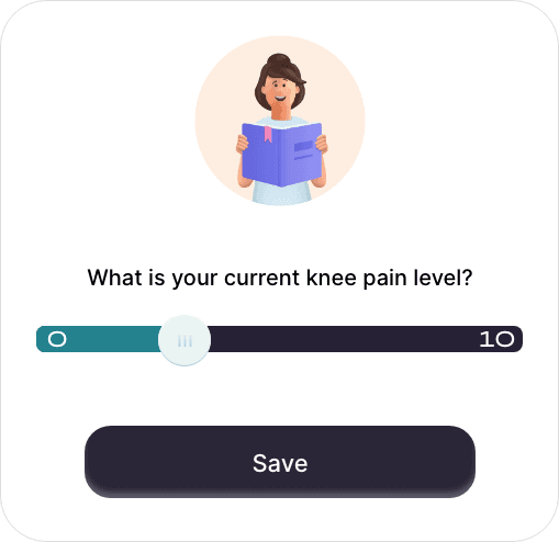
Recording pain score
Hypothesis
Ability to record pain score to determine the programmes effectiveness.

Visuals of hypothesis 1, 3 & 4
Balancing aesthetics and usability for user comfort
Hypothesis
Stimulation programme page is one of the screen where users are expected to spend most of their time during their treatment. Below I have demonstrated the thoughts went behind designing this screen using widely followed design practices.
Golden ratio
I applied the golden ratio to determine the optimal proportions between the image at the top and the controls at the bottom. This created a visually balanced and harmonious layout, further enhancing the overall user experience.
Thumb-zone optimisation
The age group of users using this app will be mostly above 40 years and the device they are gonna use is not their mobile but the 7-inch phablet that they get along with the kit.
When holding the 7-inch phablet on one hand it eventually restricts the reach of the thumb over the screen. So I used the thumb zone concept and placed all the vital controls to run the stimulation at the bottom of the screen. This ensures users can easily adjust the settings for the stimulation
Usability principles
To ensure a balanced and effective design, I used established design principles to guide the structure, layout, and visual hierarchy.
Knee pain relief - Stimulation
Making experiments
A usability test was conducted with 8 users to find the effectiveness of the user interface to run the simulation programme. During the test, the users are encouraged to think aloud while performing the tasks.
Scenario
You are a new user who purchased an electrotherapy garment to help manage knee pain. You have the app on the phablet provided with the garment and would like to experience the product from setting up the app to using the garment for the first time run.
Tasks
Onboarding & registration
Complete the onboarding screens and registration
Choosing a stimulation program
Explore the app to find the section where you can choose a stimulation program. Select a program that interests you.
Garment preparation & stimulation run
Following the app's instructions, put on the medical garment as instructed. Within the app, initiate the chosen stimulation program.
Reviewing results
Once the stimulation program is complete, explore the app's results page.
Feedback and Interviews
Insights 1
Participants were confused when asked to choose a leg after already being shown how to wear the garment on the previous screen.
User interface designs from the first usability test
Insight 2
Several participants proceeded to the stimulation screen without looking at the instructions on how to wear the garment.
User interface designs from the first usability test
Recommendations (1&2)
Moving 'Choose a Leg' to the previous screen created a more connected and intuitive experience.
Additionally, making 'Garment Setup' a mandatory first step for new users ensured they had the necessary knowledge to wear the garment correctly before starting treatment.
Redesigned user interface screens
Outcome
The second usability test showed that the design changes, guided by usability principles such as flexibility, efficiency, and user control resulted in a more intuitive and user-friendly experience for first-time users.
Insight 3
Some participants were unsure how to effectively adjust the parameters to achieve their desired treatment outcomes. Being their first experience with the app, created a sense of uncertainty and made the experience feel overwhelming.
Some participants explicitly requested recommended settings or starting points to guide their initial use of the programme.
User interface designs from the first usability test
Recommendation 3
Providing contextual help within the interface empowered users to understand and control the parameters effectively for a better outcome of the programme.
Redesigned stimulation screen
Redesigned stimulation screen
Outcome
Integrating contextual help, recommended settings, and a guided tour within the interface empowered users to effectively utilise the stimulation program, leading to increased confidence, understanding, and control over their treatment.
User feedbacks
Pain & Dietary Logs: There's often a strong link between diet and pain. Allowing users to track both in one place could reveal valuable insights and improve self-management.
Programme results interface design
Low Battery Reminder: A feature to prevent interruptions in treatment and maintain device effectiveness.
Garment battery notification interface design
Personalisation: Allowing a real-time adjustments to empower users to adjust their treatment based on their immediate needs and sensations.
Stimulation interface designs
From hypothesis to launch
By adopting the core principles of Lean UX, I have successfully navigated the complexities of designing a user-friendly mobile application for managing knee pain.
The final design, refined through usability tests and user feedbacks, was confidently submitted for medical trials, poised to make a positive impact on those seeking relief from knee pain.
Takeaway
The Importance of User-Centricity: This project reinforced the critical role of user feedback in driving design decisions. By actively involving users in the design process through testing and interviews, I was able to uncover valuable insights that directly shaped the final product.
The Power of Iteration: Following an iterative approach allowed me to refine the design based on user feedback and adapt to unexpected changes in requirements. This flexibility ensured that the final product met both user needs and project goals.
The Value of Collaboration: Working closely with the science and engineering teams was essential for understanding the technical constraints and ensuring the design aligned with the product's functionality.
Balancing Aesthetics and Functionality: While aesthetic principles like the golden ratio are important, they must be balanced with usability and functionality to create a truly effective product.
Adaptability: The unexpected design change highlighted the need for adaptability in the face of evolving requirements. Embracing this change as an opportunity for growth led to a more innovative and user-centered solution.


